
Implementation of News (Video & Text format) on Live App
My role
As the UI/UX designer, I collaborated with the development team to revamp eNanyang’s digital platformto include new module i.e. News in video & text format, focusing on user experience improvements, responsive design.
The goal
Enanyang's mobile app required a fresh approach to presenting news content, which previously lacked a streamlined and engaging format for both video and text-based stories. The goal was to design and implement a module that would make it easy for users to access the latest news in both video and text formats, with a layout that is visually appealing and easy to navigate. By introducing this new module, we aimed to enhance user engagement and improve content discoverability on mobile devices.
Who are the users
The primary users of this News Section module are:
Casual readers who prefer reading articles and news updates.
Video enthusiasts who want to watch news in video format.
Power users who want to switch between text and video formats easily. This diverse audience required a flexible and user-friendly interface that accommodates both text and multimedia content seamlessly.
Design process
Methodology: I followed a user-centered design approach, where I focused on understanding the users' content consumption patterns and needs. The design was focused on ensuring users could easily toggle between video and text-based news, and access the content without any friction.
Roadmap: The design process was structured as follows:
Discovery Phase: Requirement understanding from the stakeholder and analyzing user behavior around news consumption (text vs video).
Design & Prototyping: Wireframing and prototyping the new News Section module with focus on responsive design for mobile screens.
Testing & Iteration: Conducting usability tests to validate the design and gather feedback for refinement.
Metrics: Success metrics included user engagement (interaction with video and text), time spent on the News Section, and user satisfaction with content navigation.
Tools used

For designing UI components, icons, and other visual elements for the app and testing interactive prototypes.
Research
During the research phase, I found that users of news apps often prefer content that is:
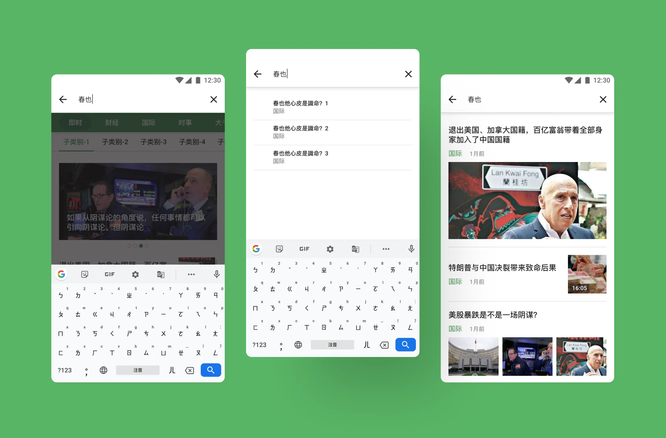
Easily navigable: Users want to access different types of content quickly and without clutter.
Adaptable: Some users prefer reading news, while others prefer video. We needed to provide a seamless experience for both formats.
Mobile-optimized: Given the mobile-first nature of the app, it was essential to design the module to fit well on smaller screens, especially when switching between video and text content.
User feedback also showed that users wanted quick access to multimedia content and to be able to easily switch between the two formats within the same section.
Sketches, Wireframes, Graphics, Prototype
The design process began with sketching low-fidelity wireframes to determine the layout and interaction flow for the News Section. We then moved on to high-fidelity mockups, ensuring the interface was clean, intuitive, and focused on ease of navigation. Special attention was given to making sure the module provided smooth transitions between text-based articles and videos.
Key Features Designed:
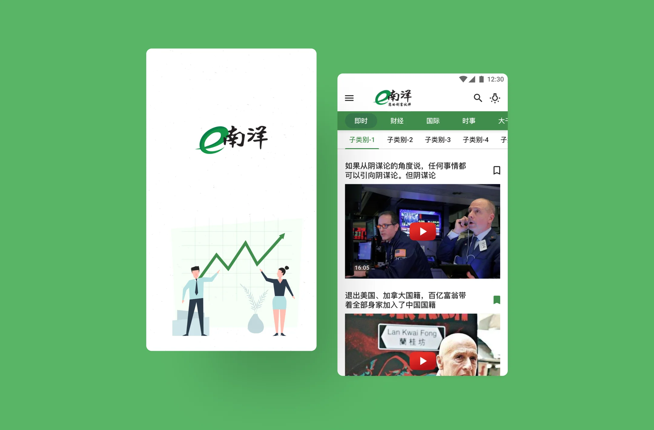
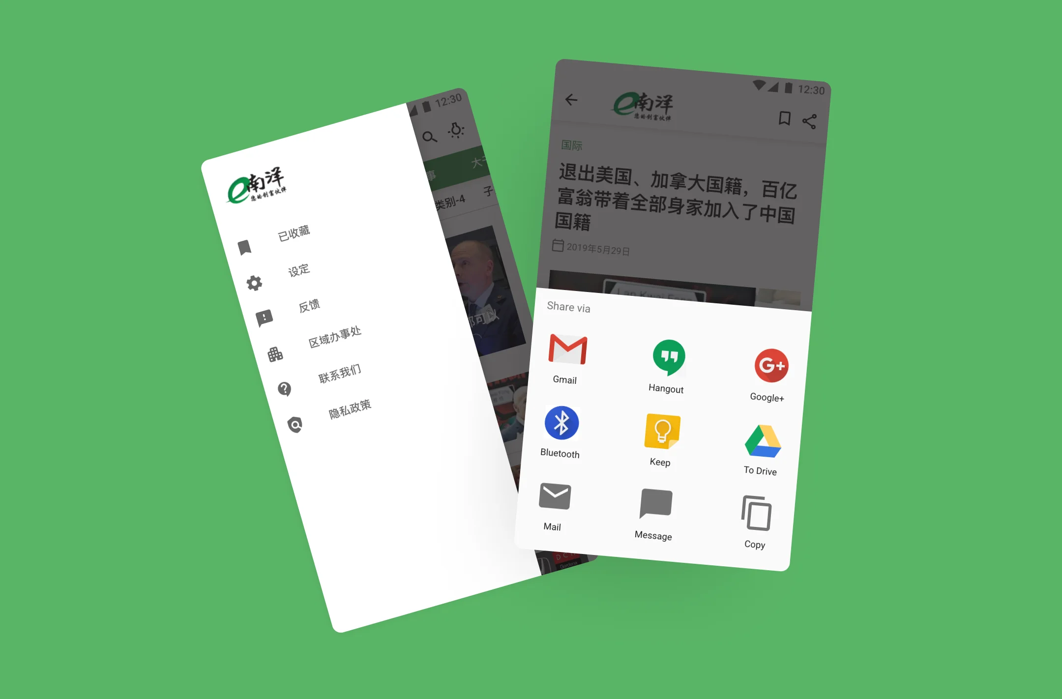
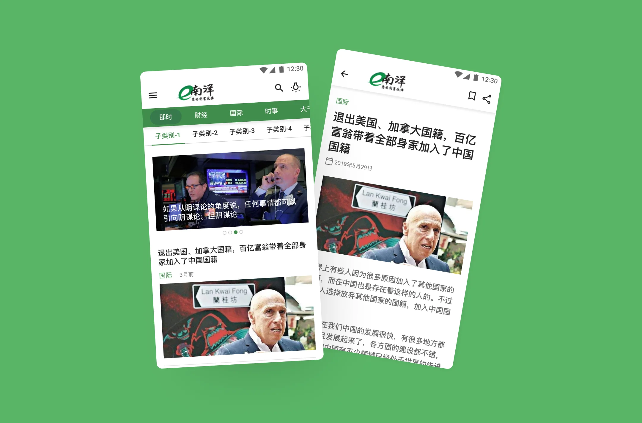
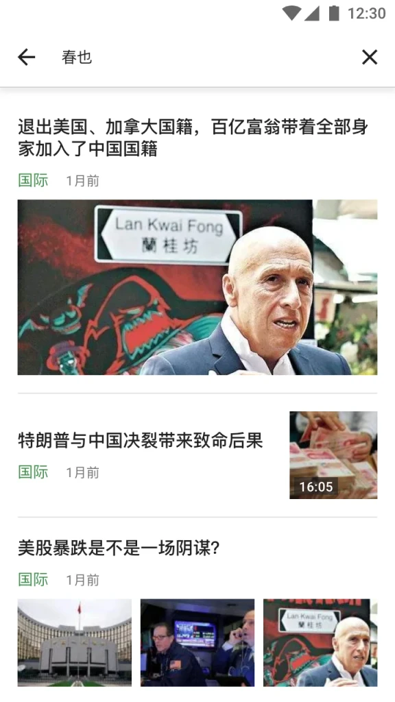
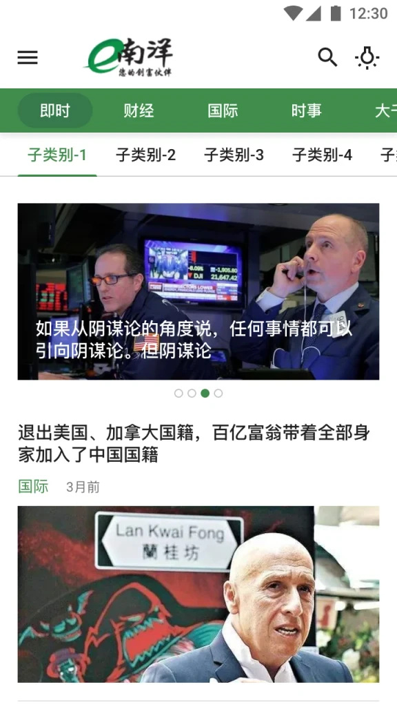
News Cards: Cards that feature a mix of video thumbnails and text snippets to attract users to specific content.
Tab Navigation: Clear options for users to toggle between video and text news formats.
Video Player Integration: A video player that is easy to navigate, with simple play, pause, and fullscreen options.
Text Articles: Clean and simple text formats, optimized for mobile reading.
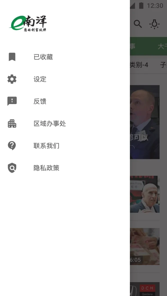
Responsive Layout: Ensuring that the module is fully optimized for various screen sizes and orientations.
Design
The final design of the News Section module adhered to a consistent mobile-first aesthetic:
Typography: Clean, sans-serif fonts that are easy to read on mobile devices.
Color Palette: Neutral tones with accent colors for key content areas, maintaining clarity and emphasis.
Icons: Simple and intuitive icons for play buttons, toggles, and navigation actions.
UI Elements: Optimized buttons, sliders, and media controls for an intuitive interaction experience.


The impact
The introduction of the News Section module significantly enhanced the user experience by improving content discoverability and providing a more engaging interface. Users were able to interact with both video and text content seamlessly, increasing time spent in the app and overall user satisfaction.